Accelerating Prescriptive Analytics Using Einstein Discovery Templates
There is a good chance that you want to create a Machine Learning model for your business to aid decisions, but you are not sure where to begin. Einstein Discovery, located in Tableau CRM (Formerly Einstein Analytics), will enable you to do just that with clicks, not code. Unfortunately, “Machine Learning” and the fancy terms associated with it can be quite overwhelming and may have discouraged you and others from using Einstein Discovery to deliver predictive and prescriptive insights. Using Einstein Discovery Templates, this will no longer be the case!
Einstein Discovery Templates are out of the box solutions that create a training dataset and a predictive model for you in a matter of minutes. This allows you to iterate and improve the model efficiently so that you can quickly deploy it for use. You can this in action below, as it powers a component that predicts the likelihood to win an opportunity!

Why use Einstein Discovery Templates?
Templates are the simplest way to kickstart your journey in Machine Learning. Templates will perform much of the heavy lifting in creating a predictive model and will leave you the work that requires your domain-specific expertise. Templates leverage the existing objects within your Sales Cloud, so you do not have to manipulate CSVs or find the right dataset. You can incorporate external data, but the dataset for your model will consist mostly of standard and custom fields from your org. Speed is the name of the game here, and all you need is a few clicks to get started. The only non-trivial step is to choose which of the templates make sense for your goal.
Which Template is Right For You?
There are three templates to choose from – Maximize Win Rate, Minimize Time to Close, and Maximize Customer Lifetime Value. Each of the templates provides a perspective on commonly implemented use cases in Sales Cloud. Let’s take a closer look at each of them.

Maximize Win Rate
This is a popular template because it uses your data to answer “What factors contribute to a won opportunity?”. This template will analyze the characteristics of closed won opportunities and suggest changes to increase the likelihood to win early stage opportunities. This is a classification model, which means it will predict a discrete variable. In this case, the model will predict whether an opportunity falls into one of two categories: won or lost.
Minimize Time to Close
Time is a precious resource, and this template will answer “How long will it take this opportunity to close?”. Using this framework will reveal the characteristics that lead to shorter opportunities, which can help your org make decisions for how to best delegate its resources. This is a regression model, which means it predicts a continuous variable. In this case, the model will predict the number of days it takes an opportunity to close, which can be any number.
Maximize Customer Revenue
Unlike the prior two templates which focused on the Opportunity, this template focuses on the Account. This template will show you the properties of an account that lead to higher sales, which can help shape your account management strategy. This is also a regression model, because the model will be predicting “Customer Revenue”, which is a continuous variable.
For the purposes of this post, we will be walking through how to implement and iterate on the Maximize Win Rate Template – the classification model. Check out this article to learn how to approach regression models.
Creating Your Model
Creating a model from a template requires two steps. First, open Tableau CRM, click “Create” at the top right, and select “Story” from the menu. Then, select the appropriate template from the options listed.

The template will validate that you have enough records for it to run properly, and then a new App will be created for you. In your new App, you will see an item under “Stories”. This is called an Einstein Discovery Story, but it is really a Machine Learning model that you have just created!

If the template is stopped short and you see that the “minimum requirements are not met”, then that means that there are not enough existing records in your Sales Cloud for our target object. Maximize Win Rate and Minimize Time to Close focus on the Opportunity object, and you will need at least 400 records. Maximize Customer Revenue targets the Account object, and this requires at least 400 distinct accounts with at least 1 closed won opportunity. There are other checks that are done before the model can be created, you can check what these are by hovering over the information bubble to their right.
Maximize Win Rate
For this walkthrough, let’s take a look at the Maximize Win Rate Template. Again – this will explore the key factors for winning deals. Remember, all templates follow the same creation process.
Once you execute the template, you can check your Data Manager, you will see that a new data flow has been created – using some of the following objects: Account, Opportunity, Opportunity History, User, UserRole. Note that the following objects are also used but are not required to execute the model, however, they will provide helpful insight: Product, Price Book, Task, Event.
So far so good. We now have a fully functioning Machine Learning model that uses the existing data in your Sales Cloud to predict the outcome of an opportunity – but the work is not done yet. Following the outline below, I will discuss the next steps in this process – which include evaluating your model and cleaning the data to improve the evaluation.
- Reviewing the Story
- Understanding the Confusion Matrix
- Interpreting the Model Evaluation
- Determining the Threshold
- Improving Your Model
- Looking for Bias
- Feature Engineering
- Conclusion
- Next Steps
Review The Story
After running a Story, navigate to the “Model Evaluation” tab to see how well the model actually did. You see a set of values under the“ Accuracy Analysis” label. This set of values is typically described as the Confusion Matrix, and is critical to understanding how good the model actually is.

Understanding the Confusion Matrix
Don’t let the name get to you – the confusion matrix is actually quite simple. When the model makes a binary prediction (won or lost) on an opportunity record, it then compares that prediction to the actual value of the record. Using this comparison, we can categorize the prediction in one of four ways:
- True Positive: model predicted the opportunity was won, and the opportunity was actually won
- False Positive: model predicted the opportunity was won, and the opportunity was actually lost
- True Negative: model predicted the opportunity was lost, and the opportunity was actually lost
- False Negative: model predicted the opportunity was lost, and the opportunity was actually won

There are two different variables at play here: the predicted outcome and the actual outcome. Each of these outcomes can be either negative or positive. The four categories listed above describe each possible scenario for a prediction, and the confusion matrix is a representation of this.
The number of predicted outcomes divided by the number of actual outcomes will give us the likelihood of each scenario for a given prediction. For example, the True Negative rate means that when the model determines that an opportunity is lost, then there is an 84% chance that the opportunity is indeed lost.
The confusion matrix helps us understand the reliability of our predictions, but there are a few more important metrics that assess the model and describe its relationship with the data provided. We will be looking at how to assess your models using the AUC, GINI, and MCC scores. There are other metrics out there that are also useful, take a look at this post to dive deeper into what the other metrics tell you.
Interpreting the Model Evaluation
Don’t be alarmed – AUC, GINI, MCC – are simply different ways of telling you how close your model is to make a perfect prediction. Before we dive into this, let’s understand what is going on behind the scenes.
In binary classification, the model will take a segment of your data set and assign a score to each record (this is called your training dataset). This score represents the model’s judgment on how likely that record is to fall under one category or the other. We are looking at a Maximize Win Rate model, so an opportunity with a score of .34 tells us “there is a 34% chance this opportunity is won.

Let’s take a look at the assessment below for Maximize Win Rate:

AUC (Area under the ROC Curve)
This is the probability that the model ranks a random positive example higher than a random negative example. A high AUC (1) means that there is a high probability that a positive prediction will have a higher score assigned to it than a negative prediction. A low AUC (.5) means that this probability is random.
Interpreting AUC
We can see that the AUC is relatively high at .89. This tells us that when two examples of different outcomes are selected at random (one lost opportunity, one won opportunity), the model is 89% more likely to assign a higher score to the positive opportunity (won) than to the negative one (lost). This is a good score, but keep in mind that higher scores also raise suspicion of data leakage. Data leakage is when fields are populated as a direct result of the predicted outcome (for example, the “Stage” of an opportunity in Maximize Win Rate). A good rule of thumb is that an AUC higher than .96 means your model is likely too good to be true, and the data you are feeding it deserves a closer look.
GINI (Gini Coefficient)
This measures how far your predicted values are from a perfect binary distribution. A high GINI (1) indicates that the scores assigned by the model are perfectly distributed between 1 and 0. A low GINI (0) means that the scores assigned are random.
Interpreting GINI
GINI measures the variance of scores that the model assigns the target object (opportunities in this case). A GINI of .79 tells us that 79% of the scores assigned by the model exist near 0 and 1. This is an indicator of a healthy model because this trend shows that the model is making accurate predictions. As with any model metric, a GINI above .96 should raise concern. Although it would imply a near-perfect prediction, it would also suggest that middle range scores are not being assigned, which is concerning because it implies that there is leakage in the model. A low GINI score should also raise concern because it means the model is not equipped to make accurate predictions. The GINI coefficient indicates how far off the model is from making perfect predictions by giving us greater insight into the distribution of the scores it assigns records.
MCC (Matthews Correlation Coefficient)
This metric summarizes the confusion matrix, which can be used to assess the performance of the model. A high MCC (1) means that there were no false negatives or false positives during model validation. A low MCC (0) means that the predictive capabilities are no better than a coin flip.
Interpreting MCC
The MCC is your best indicator in assessing the quality of your model. It is the relationship between the predicted classification and the observed classification. MCC is a correlation coefficient, which means that we can think of it similarly to how we consider the “R value” of linear regression.
An MCC score of .58 indicates a moderately strong relationship between the predicted class and the actual class of the target variable. The MCC score will typically be your lowest metric because it will also take into consideration how well your model avoided false negatives and false positives. Remember that the confusion matrix essentially contains four components: True Positives, False Positives, True Negatives and Four Negatives. The MCC is the most complete and honest summary of all these four components into a single score, which is why it is a very trusted confidant on how good your model is.
Now that you understand these three metrics at a high level. Let’s explore how you can leverage them to assess your model!
Determining the Threshold
The Threshold is the value used by the model to make its final decision in classification. The model assigns each opportunity a score, which is then compared to the threshold to make the classification. You can see this in action when you look at your “Prediction Examination” under “Model Metrics”. This tab will show you how the model performed on 100 records from the dataset.

Let’s take a closer look at how some of the opportunities were scored.
In this example, we have changed the threshold from .31 to .67. Now the model incorrectly classifies the opportunity as lost because the bar is much higher for opportunities to be classified as won.

The model correctly classified this opportunity as won because its score of 0.92 is greater than the threshold of 0.31

The model correctly classified this opportunity as lost because its score of 0.06 is less than the threshold of 0.31

So What Should I Set my Threshold To?
A good starting point is setting it to whatever optimizes the MCC score (You can learn how to do so here).
The more complicated answer is: “it depends”. As the expert in your business field, this is where your expertise is critical: What makes sense for your business?
Setting the threshold is a tradeoff between the likelihood of a false positive vs that of a false negative (Lost Opportunities predicted as won vs Won opportunity predicted as lost). The right threshold point depends on which of the two errors is less costly. When trying to predict a won opportunity, is it more costly to predict a losing opportunity as won or to predict a winning opportunity as lost?
In some cases, a false positive is much more costly than a false negative, sometimes the opposite is true. The bottom line is that your threshold should be set according to your cost assessment, optimizing for the MCC score will weigh false positives and false negatives equally – so it up to you to decide how to tune the model according to your needs.
Improving the Quality of the Model
Now that you understand what the model metrics are telling you, you might be worrying that your scores are low.
A common expression used to describe Machine Learning models is “Garbage in, garbage out”. A model is only as good as the data it is given, and real-world data is messy. This calls for a process described as Feature Engineering, which is how we can organize messy data to make models more reliable.
Hunting for Bias
Before starting this process, we must do a thorough examination of the data. We need to look for underlying trends that can distort the impartial predictions we want from our model. A significant disposition of a model to predict one outcome over the other is called Machine LearningBias.
There are numerous types of Machine Learning Bias, with more being defined as we continue to use AI and Machine Learning tools to make insights. If you want to learn more about this topic, this module covers it extensively. In Tableau CRM, you can use the “Explore“ tool to see trends in your data and detect potential bias from an early onset.
To look for bias in data, you need to keep the following in mind: Machine Learning Models make predictions about your target object based on the examples they are taught. If the Maximize Win Rate Model is exposed to significantly more lost opportunities than won opportunities, it will be predisposed to predicting opportunities as lost.

Another area of potential bias is a skewed variable. If you include a variable that has a skewed distribution, the model will associate the dominant value of this variable to the outcome variable. This will contort the insights we get from the model because will give more weight to records that have the dominant value than those that do not. For example, if the “Lead Source” field is 90% “Web”, then the model will inherently observe less won opportunities for other values in this field. As a result, the model will be inclined to view non “Web” opportunities as lost. Einstein Discovery detects dominant values for you in both the “Edit Story” mode, or in the “Recommendations” tab, and gives you to option to immediately remove them from the model.

Even after removing dominant values, the data is still flawed. The data is not distributed in terms of the outcome variable, and we need to find a way to balance this out to avoid biased predictions from the model.
Bias and responsible use of AI
As stated before, the predictions are made based on the training examples with which the model was taught. Therefore, it’s important to be aware that AI may not be neutral, but will be a mirror that reflects the bias that exists in society back to us. This article discusses the crucial difference between Dirty Data and Biased Data. The aforementioned topics such as dominant values, missing values, and skewed distributions are put in a very different light when approached from this angle, and therefore the corresponding warnings that Einstein Discovery provides for these are even more important.
Moreover, Einstein Discovery provides the possibility to detect proxy variables. A proxy variable is a variable or a combination of variables, that is strongly correlated to another variable. Let’s take an individual person’s Race as an example of a variable that should not be included in a model to approve Loans. Because of a historical practice of redlining in the US, zipcode + income = race. That means even if you are not making predictions using the explicit “race” variable if you are using zip code and income, the predictions will be influenced by race. However, when setting up the model, you may not be aware of this correlation and without knowing it, you may create a biased predictive model. Einstein Discovery allows the user to mark a field (such as Race, or Gender) as a ‘sensitive field’, and when building the model, Einstein Discovery will automatically detect such correlations and proxy variables and warn the user accordingly.
Feature Engineering
Now that we know the vulnerabilities of the model, let’s look at three easy ways to do some Feature Engineering to enhance its performance. This is considered the “heavy lifting” portion of the model building process and will require your domain expertise to get it done.
Strong Predictors
Strong Predictors, Top Predictors, Strongest Correlators, all different phrases that mean the same thing – the fields that have the highest association with your outcome variable. After running a Discovery Story, the first thing you will see in your insights tab is the predictor with the strongest relationship to the outcome variable. As we can see below, the top predictor has a 4% correlation to the outcome. This is a weak correlation, which means the model won’t have much predictive capability, so let’s look for other predictors that we could include in the model.

Finding Predictors
To find strong predictor fields, consider fields that your business tends to use when looking at an opportunity. To start, take a glance at an opportunity record in your org. What are some fields here that are excluded from the model?

For starters, it looks like we are leaving out the “Activity” field and “Primary Campaign Source”. These could be important because they are both directly tied to an opportunity and could tell us both its origins and the attention it was given. Let’s add these to the dataset in the dataflow builder (see how to access the data flow here).
When we load the opportunity, we can include fields related to the “Activity” object in the data flow, as well as any field related to “Campaign”. Add any other fields or objects that are related to opportunities in your org, and run the data flow with the new data. You will then need to re-run your story with the latest data.

It could be that you ran the model and the variables you have added do not have a high correlation with the outcome variable. The model will only be as good as your predictors, and your predictors will only be as good as the data. So if the model does not improve, you are still including relevant factors in your model and it could mean that these factors do not correlate to one outcome or the other. The practice of finding predictors requires you to consider the important factors that go into your outcome variable and add them to your dataset. Although the template will get you started, it is always good dive a little deeper and find more factors that make sense for your business.

Judging Predictors
After you run the story, you will see a set of visuals that describe the relationship between the variables and the outcome. The variables at the top of the page have the highest correlation to your outcome. If you have a strong predictor that has more than 30% correlation with the outcome, then this could be a source of data leakage in your model, and you will need to judge if this variable is really a factor of the target or a byproduct of it.
Filtering
To paint a clearer picture of the data, we need to establish the scope through which the data will be explored. This is called Filtering, a simple yet powerful way to remove bias from the dataset and tell a more precise story through the model.
How to Filter Data in The Model
To filter the data, go to the “Edit” tab to see all variables that are going into the model. Select a variable and select what you want to focus on.
Best Practices for Filtering
When we filter, we are decreasing the number of records, so there are a few things we must do to ensure this does what we want.
- Exclude all other categories from our story. This will ensure that we are actually filtering. (Unselected Values: Exclude from story)
- Choose a variable with a max of 10 categories, and select a category with least 10% of the records. Do not filter a variable with high cardinality or a on a category with a small number of records.
- Make sure that this does not impair the distribution of your outcome variable. Your filter should improve the balance of records in your outcome variable. To verify this, check on the distribution of your outcome variable after you have executed the filter.

Filtering In Action
The ‘Account Type’ of an opportunity is shown here. This field has a few different categories each with a different number of records. Let’s say we are primarily concerned with opportunities involving our “Enterprise Customers”. We select only Enterprise Customers, so now our model will only make predictions about this Account Type.

You can also filter on continuous variables, such as values and dates. In fact, filtering on dates is a very common and effective way to balance the distribution of the outcome variable. When filtering on continuous variables, the same rules apply as the ones listed above except you do not have to worry about the cardinality of the variable, only the number of records you are including. Let’s say you want to look at “Opportunities for Enterprise Customers within the Previous Fiscal Year”.
You can filter dates using the same technique as before, but be mindful how this affects the distribution of your outcome variable.

You can now focus your model to your level of interest. In doing so, your model is likely to improve because you are balancing the distribution of your outcome variable.
Restructuring categories to describe the data better
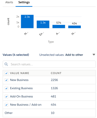
Now that we handled the scope of the data, let’s look at another area in the model that can use some improvement. When looking at our variables, we can see that there are inconsistent categories.
Let’s take a look at the categories for “Opportunity Type”. Two characteristics of the Opportunity are mixed up here, i.e. the Opportunity being New or Existing, and the Opportunity being Add-on or Not. This is further illustrated by the existence of a label like “New / Add-on Business”. One of the problems with this, is that the model will see “New Business” as something completely different from “New / Add-on Business”. That is not correct, because both labels have one thing in common: they cover New business. Therefore we would like to solve this mixture of different categories, and split them out again into separate features, which is what we will do in this section.
Enter One Hot Encoding, a technique to represent each category with a binary value to precisely describe the behavior of the data. By creating three main categories, we can represent whether it is relevant to the record – which allows for a combination of categories to be represented.
We will need to commit our changes in the original dataflow, you can see how to access that here. The field we want to clean up is “Opportunity Type”, so look for the Compute_Field of the opportunity node. Depending on which template you are using, the relevant node will be in different locations in the dataflow, or you may need to create it.

Create new fields for each category of the variable we are looking to organize. These three fields will be our binary categories that represent the different “Opportunity Types”.
We have three fields here to represent each unique “Opportunity Type”, remember – an opportunity named “Add-On/New Business” is really a combination of two categories.
For each of these three fields, you will need to write a SAQL expression to indicate when you want to label this field with 1 or 0. You can learn more about SAQL here.
In our case, we want our dataflow to examine the “Opportunity Type“, and in the case where it includes the word “New” then we want “is_New_Business” to return a 1, to indicate that it is new. The same thing for “Add-on” in “is_AddOn_Business”, and so forth.

To extract the keyword that we want, we can use the match function to determine if our Opportunity Type contains “new”, “add-on”, or “existing”. If it does, then populate the appropriate category with 1, if not then 0 – to indicate that it does not exist for that record.
The match function is very useful for performing One Hot Encoding on your dataset. It allows you to find a sequence of characters within any string. So if you have a field with inconsistencies you can extract the information you want and make separate encoded fields. Or better yet, if you have a high cardinality field, you can use match to examine that field from a higher level. Let’s see this in action.

Let’s take a look at how our model did with these new changes.
Looks like our work paid off! we were able to raise our MCC score to a significantly higher level.

To recap, you just applied simple Feature Engineering concepts to improve your dataset and in turn – the model. If you apply these concepts and the quality of your model decreases, then that is okay – remember this process is sometimes more art than science. Hunt for bias in your data again by looking at the distribution of the dataset, and assess what the strongest predictors are. The outcome distribution and the correlating variables are the deciding factors in determining the quality of your model, our goal in Feature Engineering is to make it easier for our model to detect the correlations for either outcome by bringing structure to our dataset.
Create new fields for each category of the variable we are looking to organize. These three fields will be our binary categories that represent the different “Opportunity Types”.
We have three fields here to represent each unique “Opportunity Type”, remember – an opportunity named “Add-On/New Business” is really a combination of two categories.
For each of these three fields, you will need to write a SAQL expression to indicate when you want to label this field with 1 or 0. You can learn more about SAQL here.
In our case, we want our dataflow to examine the “Opportunity Type“, and in the case where it includes the word “New” then we want “is_New_Business” to return a 1, to indicate that it is new. The same thing for “Add-on” in “is_AddOn_Business”, and so forth.
Feature Engineering Checklist
We only discussed three simple, out-of-the-box methods for Feature Engineering, but there are more that you can consider as you continue to work with Einstein Discovery. For an in-depth discussion on this then check out the blog “Taking your model from good to great“. In addition, here is a checklist to help guide you through the Feature Engineering process:
- Clear and obvious meanings for fields
- Each field should have a clear and obvious meaning to anyone on the project.
- If you find yourself having to ask other people about what the feature represents, then it is probably not a good feature.
- Fields are actually describing your target object
- Put your variables to in context of your target object to see if they make sense.
- If a field can be used as an adjective for your object, then it is a relevant variable.
- e.x (Red Car, Member Customer, Channel Opportunity, etc)
- Check for Data Leakage
- If a variable has over 30% correlation to the outcome, be careful that the variable is not causing leakage
- e.x (Stage will influence if an opportunity is Won)
- If a variable has over 30% correlation to the outcome, be careful that the variable is not causing leakage
- Limit high Cardinality Fields and the level of your data
- if there are over 100 different categories for your field, then extrapolate them to a higher level.
- e.x (500 different products can be categorized among 10 different product families)
- if there are over 100 different categories for your field, then extrapolate them to a higher level.
- Continuous variables are bucketed appropriately
- determine that your binning is appropriate and makes sense for your business.
- e.x (# of Won Opportunities for an Account may be better grouped in 3 bins then 8 different bins)
- determine that your binning is appropriate and makes sense for your business.
- Dates fields are relevant
- Make sure that your model is only looking at a time period that is relevant.
- e.x (You can create distinct models for each fiscal quarter)
- Make sure that your model is only looking at a time period that is relevant.
- Outliers are not influencing the model
- Continuous variables: set a limit on continuous variables so that anything going above this limit will be set equal to that limit.
- e.x (a limit for age of an opportunity will be set at 100, so an opportunity of age 200 will not act as an outlier)
- Categorical variables: if a category does not appear at least 5 times in your data, consider removing the record from your dataset.
- Continuous variables: set a limit on continuous variables so that anything going above this limit will be set equal to that limit.
- Missing Values are not influencing the model
- In the original feature, replace the missing values as follows:
- Discrete variables: add a new value to the set and use it to signify that the feature value is missing.
- Continuous variables: use the mean value of the feature’s data so that the model is not affected.
- In the original feature, replace the missing values as follows:
Conclusion
Woohoo! You have officially created and refined a Machine Learning model! Through finding KPIs, filtering your data, and encoding messy fields – you have developed the basic toolset to improve your model and deploy it. Deploying your model will share the powerful tool you have just created with its intended users, which will empower them to make data-driven insights for your business. As with any useful tool, maintenance is necessary. As you deploy your model, and the data in your Sales Cloud is updated, it is important to consider how these changes can affect the performance of your model. The work is never truly over, but with it comes more interesting problems to find solutions to, and now you are well equipped to do so!
Do remember that the story templates are fast start templates that make most of the choices for you and especially if you are new to Einstein Discovery it’s a great way to get started quickly on a solid foundation for your ML efforts. The product team is working on bringing more use cases to the platform, so stay tuned for release updates.
Thanks for this great article